What were the main forces shaping the field of information visualization throughout the last century?
My book with art & design publisher TASCHEN looks at the incredibly rich history of infographics and data visualisation, tracing their evolution from the Middle Ages right through to today’s computer-based visualisation.

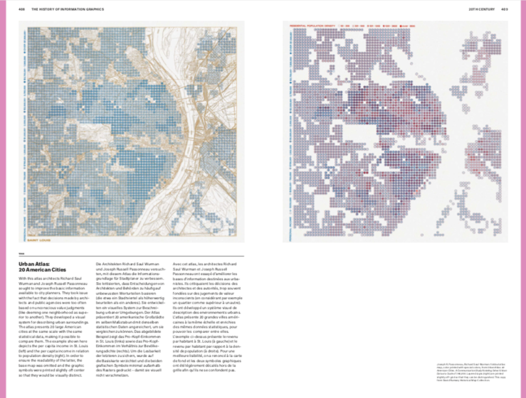
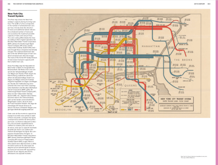
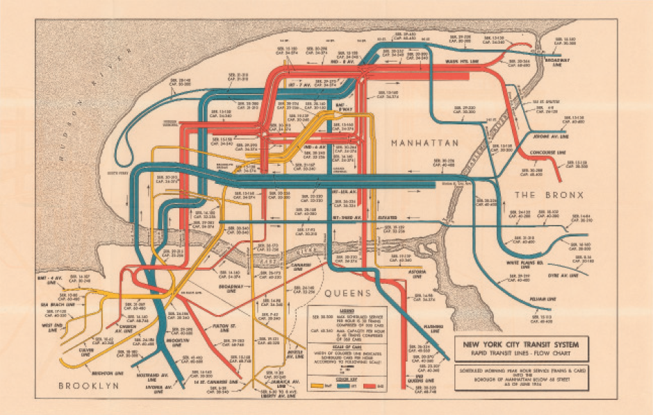
From the start of the 20th century the popularization of information graphics continued just as had been observed in the century previous. New contexts and uses for info graphics included illustrated magazines, popular science books, wallsized charts and visual aids in schools and exhibitions and in business communications. Today information graphics are ubiquitous: in newspapers, on websites, and in popular books of every kind.

The spread into numerous media channels has resulted in a widened circle of professional infographics producers. In addition to scholars and scientists, journalists and designers have increasingly entered the field. While into the 19th century the scholars wellversed in the topic and content of a graphic, e.g., the “domain experts,” worked closely with illustrators and engravers or even printed their own graphics, now larger teams are often devoted to this work in publishing houses and editorial departments.
A greater degree of quality control is also therefore necessary.

The 20th century saw the expansion of an initially small circle of scholars and experts who dealt with the theory of information visualization and identified sources of error. Authors of specialist literature range from ÉtienneJules Marey, who published his forerunning La méthode graphique in 1878, to Willard C. Brinton (Graphic Methods for Presenting Facts, 1919), Jacques Bertin (Sémiologie graphique, 1967), and Edward Tufte (The Visual Display of Quantitative Information, 1983), who emerged in the field over the course of the 20th century. Today we have at our disposal a wealth of knowledge on many theoretical aspects of information visualization.

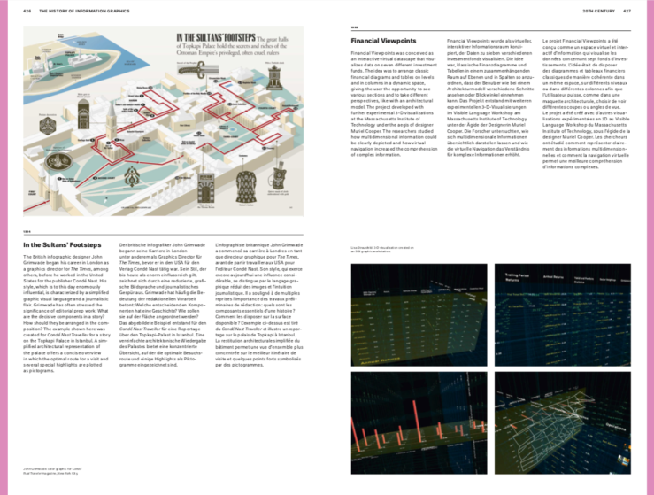
From an aesthetic viewpoint modern design played an important role in the 20th century. Many designers tried to find a contemporary visual language, including in the creation of infographics. A second even deeper transformation emerged with the development of digital technologies. Thus began a media technology revolution, which has impacted the practice of information visualization in ways that are to this day not fully ascertainable. Some of the effects are however already apparent. First of all, the production process of information graphics being partly or entirely automated. By the 1960s, there were initial attempts at automating the process of data collection and its transcription into statistical maps.

Since as recently as the 1990s, intensive research into visualization has taken shape in computer science. In this context, not only have new visual forms of representation been developed and tested, but questions of reception, perception, and readability of visualizations have also been studied. This is not just about the correct representation of facts and data, it is also about navi gation and accessibility of large amounts of data, and supporting human-computer interaction. This process began in the late 20th century and has continued to expand in the present day.
This text was translated to English from my German original by Thea Miklowski. The HISTORY OF INFORMATION GRAPHICS is scheduled for worldwide release in June 2019. Get it from TASCHEN.

