This article is outdated. In 2018, my book on Minard’s work and legacy was published by Princeton Architectural Press. It contains lots of new insights and features — piece by piece — all statistical maps by the hand of Minard that have survived to this day.

In the ever growing field of information visualisation, there are a few historical heroes and pioneers who are always referred to when it comes to how this mode of communication has evolved. One of the most famous historical infographics is beyond doubt Charles Joseph Minard‘s Figurative Map of the successive losses in men of the French Army during the campaign in Russia 1812–1813 (see below).
Among others it was mainly Edward Tufte, who during the course of his pioneering efforts in analysing statistical graphics and establishing an “ethos of information visualisation”, discussed this graphic in his book The Visual Display of Quantitative Information (first edition 1982) and made it widely known by publishing a beautifully printed poster of it.
The piece is a very dense representation of data – it shows (on an extremely simplified map) the french army of 422,000 men moving eastwards into Russia, with the troops constantly losing men (1 mm in width equals 10,000 soldiers). The colour of the flow refers to the direction (on the retreat, the flow turns black). A temperature diagram along the bottom clarifies how the terrible frost during the months of retreat defeated what was left of the army.

It is a little less well known that this graphic originally had a twin brother: a map tracking the campaign of ancient Carthaginian military commander Hannibal, who in 218 BC decimated his troops (according to the map) from 94,000 down to 26,000 men when crossing the Pyrenees and the Alps on his journey to Italy.
Other than its counterpart on the Russian campaign, this second graphic is less abstract and sticks more closely to mapping the topography on which the events took place. It is certainly due to the lack of further statistical data and precise information about this ancient campaign that it is less dense in terms of data representation than its twin brother.

However, it still shows three dimensions of information: The chronological course of the campaign and the geographical path taken by the army as well as the force level of the remaining troops in absolute numbers as well as in the width of the “coloured zone”. Again, one millimeter in width of the coloured band equals 10,000 men, making the force level data perfectly comparable for the two campaigns.
In this approach to track the quantities of moving goods or passengers, the Hannibal graphic provides a nice link back to Minard’s earlier work – some dozens of flow maps which today are almost completely forgotten. I have recently taken the trip to Paris to look at them in the archive which keeps the majority of his surviving maps.
Charles Joseph Minard, a French engineer (1781–1870), was 88 when the above twin graphics were published in 1869 – they were among his last works. During the course of his teaching at the Ècole Nationale des ponts et chaussees since the 1830s, he had started to work on statistical representations of passenger traffic and the transport of goods within France and Europe (the underlying motivation for which was that he was involved in planning the new railways system in France).
In this context he developed the format of flow maps: mapping the movement of goods or passengers using coloured bands on simplified maps. It was not until after his retirement in 1851 that he further experimented with statistical representations and also applied his statistical cartography to historical topics such as the Hannibal and Napoleon campaign maps.
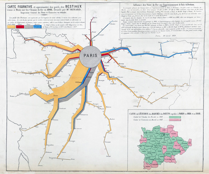
Here is an example from 1864 of how Minard used the graphical representation of the circulation of goods as a tool of investigating economical and infrastructural questions. The map shows how much meat was exported by railway from various regions of France to accommodate the capital Paris during the year 1862.

The background is an extremely simplified map of France, with sections of the Atlantic coast line, the Eastern border and some place names forming a net of topographic references. Colour coding refers to different types of cattle (yellow = beef, grey = pork etc.). The width of the coloured bands visualise how much cattle arrived in the capital from various regions of the country (1 mm band width = 1000 tons of cattle).
The smaller insert map investigates which provinces had contributed to the cattle supply of Paris in 1828 (i.e. before the railways were implemented = green provinces) and how this area had grown in 1862 (= pink provinces).
It is a noteworthy feature in Minard’s maps that he usually comments on where his data come from and how he visualised his numbers (such as that he had absolute numbers for the cattle export and that the total cattle weight that is visualised in the coloured flows was calculated by assigning an average weight to each animal, e.g. 300 kg for a cow).
The text on the upper right also contemplates on how the data visualised in the map are to be interpreted – e.g. whether the consumption of meat in Paris had grown between 1828 & 1862 because of the new railways system or whether this was a mere coincidence…
Images courtesy of the Collections de l’École des Ponts ParisTech (from Fol.10975). Thank you, Cathérine Masteau! Except to Edward Tufte, I am also indebted to the previous work done by Michael Friendly and Gilles Palsky.


10 replies on “The Forgotten Maps of Minard”
Comments are closed.